The term Brand Identity refers to the set of graphic/communication aspects and elements that build up the perception and reputation of a brand by its audience. That profoundly emotional and instinctive perception, on which the liking and consequently the success of a brand will depend.
In the food industry, the experience of traders shows that the first requirement of a brand is to answer the questions that many consumers ask when making a choice: why should I buy this product rather than another? Why should I buy a product that comes from far away?
According to them, the best answer is: because no closer product could provide you with the quality and peculiarities offered by that specific territory. Communication that the product comes from a reliable and environmentally friendly supply chain strengthens this point, but it only works if you have first managed to communicate a local particularity that the supply chain guarantees.
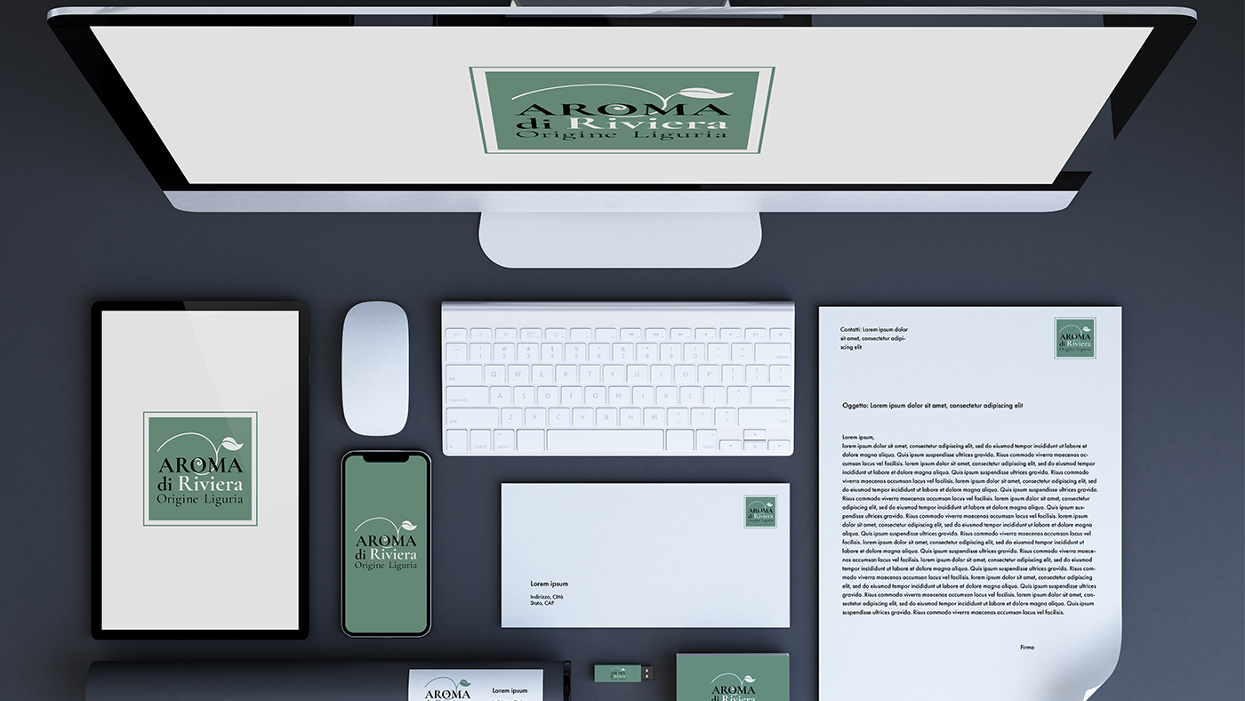
The Brand Essence, the distillation of the competitive positioning analysis of the product from which the development work of AromadiRiviera started, is to communicate the idea of a temperate Mediterranean where it is sweet to live and where even products acquire a particular suavity.
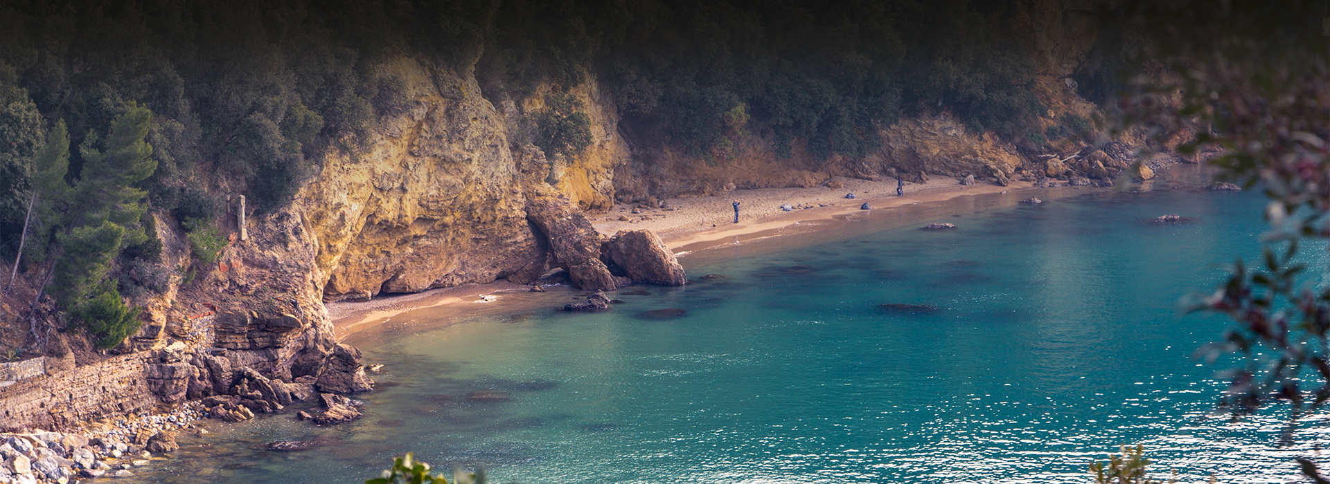
The work thus focused on strengthening a strong point of specificity that emerged from the discussion with the project partners. Liguria and the Ligurian Riviera evoke the strength that characterises the Mediterranean in the eyes of the Nordic countries but without the excesses that mark other areas. The harmony from which the success of the Riviera concept as a place of 'dolce vita' originated also lends a unique delicacy to the products.
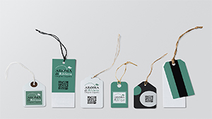
In defining the colour system, we started with a reference to the concept of aromaticity and then transformed it by extending its meaning to the peculiarities of Ligurian production. Sage green refers to the Maquis shrubland that characterises this area of the world. A blue component is added to this colour to highlight the meeting of sea and land, recalling the tones of the clear waters of the coves and a sense of the sweetness of life typical of the Riviera.
You can download the Brand Manual here (.pdf 1 MB)